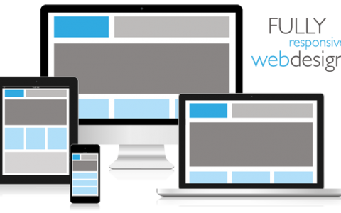
The 960 Grid systems are the way to develop a faster websites. At the mean time, developing websites should support mobile browsers while mobile usage is increasing. So, supporting all screen sizes called: Responsive web.
I am not writing this to talk about this, i am writing it to give me details and features about several Grid Systems that mostly common. This will help you decide, what to use? and what is suitable for you.
I know that there are more, but this what i know so far.
Something else, the list below is not sorted. All are awesome CSS systems.
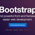
Twitter Bootstrap
Its an awesome CSS framework. Its a 960 Grid system and worked really well. It contains 2 CSS files:
- bootstrap.css : This is the main CSS file that contains all CSS styles and Grid system classes.
- responsive.css : Adding this file to your web page, will make simply supporting all screen sizes (responsive)
It’s not only CSS, you can add more:
- Components: Like dropdown menus, buttons, navigation, pagination, alerts, progress bar and more. See them here: Bootstrap Components
- Javascript: Like dropdown menus, Scrollspy, Tabs, tooltips, popovers, alerts, collapse, carousal and more. See them here: Bootstrap Javascript
- You can also customize Twitter Bootstrap for your needs, check out what you can customize here.
Skeleton
This is a light weight Grid. Skeleton CSS is a Responsive 960 Gird system. This is good for upgrading and creating custom CSS framework based on this.
It contains these files:
- base.css : It contains resets for most HTML elements.
- skeleton.css : Contains the Grid system CSS classes and responsive styles.
- layout.css : This is an empty file, where you can put your own code.
- You may also download 960 Grid PSD file.
Previous versions of Skeleton was containing more features and components. I am using this in my Blog’s CSS
320 and up
- Is another lightweight Grid system. But its a good CSS framework. It has the following features:
- Bootstrap styles for Forms, Buttons and Tables.
- Support Modernizr, Selectivizr, Responsive type tester and Design tester.
- LESS and SASS mixins and variables.
- Design ‘atmosphere’ (colour, texture and typography) separated from layout
- Upstarts for the things we build every day.
I am still not familiar with this framework, but i am working on that.
Responsive Grid System
This is another lightweight Responsive Grid system. It has these features:
- Modernizr support to detect browser features.
- Have any number of columns.. I think you will not need more than 12 columns.
- Scale to any width, because it uses percentages.
- Its easy to use.
- Files are separated. I think they will be better if they were joined together.
Foundation
I want to end my post with this because i started it with an advanced CSS framework (Twitter Bootstrap). This one is also and advanced one. Both, this and T. Bootstrap are recommended for web applications.
This one has the following features:
- Flexible 12 Grid columns.
- Has add-ons for more functionality. Like: HTML Templates, icon fonts and more.
- Has a good documentation.
- Could be customized before downloading. So, you can use part of it.
- It has lot of Javascript libraries for more functionality.
There are many awesome CSS frameworks, but i mentioned here responsive frameworks that I am familiar with.
Let me know what do you prefer and what you are familiar with 🙂

The first and the last one are a lot less CSS frameworks than they are prototyping frameworks. I was thinking blueprint should’ve been included over twitter bootstrap or foundation.
If you are using SASS/Compass, it’s worth it to have a look at Susy. Created by Eric Meyer and Oddbird.
I have recently used it on a smallish project and found it to be quite elegant.
First time i heard about Susy, looks awesome..
Thanks for sharing 🙂
I like bootstrap, easy to use, easy to modify, I have tried Foundation as well but I had to overwrite a lot of classes, so I stick with bootstrap
Thx. Have u heard about http://gumbyframework.com/ ?