You all know about Twitter Bootstrap. It’s the top front-end development framework and it’s spreading more and more. And while this framework was made on standards and most of useful components were added to it, some of us may need to override some code of it for his/her needs.
I had a chance to work on that, i mean overriding. Let me explain what I was doing and how I did that.
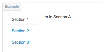
I was working on Left Tabs explained below:
I put a Youtube video in the Tab Content side and when screen size gets smaller, the video gets smaller. This is a really bad behavior for using this.
So, I added an exceptional case for Content to get beneath the tabs in small screens.
In HTML, I made this:
<div class="tabbable tabs-left">
	<ul class="nav nav-tabs">
		<li class="active"><a href="#tab1" data-toggle="tab">
			<span class="video-title">1st video</span>
		</a></li>
		<li><a href="#tab2" data-toggle="tab">
			<span class="video-title">2nd video</span>
		</a></li>
		<li><a href="#tab3" data-toggle="tab">
			<span class="video-title">3rd video</span>
		</a></li>
	</ul>
	<!-- Here is what i've added -->
	<div class="clearer"></div>
	<div class="tab-content">
		<div class="tab-pane active" id="tab1">
			<div class="tab-content">
				<p>
					<h4>1st video</h4>
				</p>
				<iframe width="98%" height="400" src="//www.youtube.com/embed/Sui1IDorBsQ?rel=0" frameborder="0" allowfullscreen></iframe>
			</div>
		</div><!-- #tab1 -->
		<div class="tab-pane" id="tab2">
			<div class="tab-content">
				<p>
					<h4>2nd video</h4>
				</p>
				<iframe width="98%" height="400" src="//www.youtube.com/embed/Sui1IDorBsQ?rel=0" frameborder="0" allowfullscreen></iframe>
			</div>
		</div><!-- #tab2 -->
		<div class="tab-pane" id="tab3">
			<div class="tab-content">
				<p>
					<h4>3rd video</h4>
				</p>
				<iframe width="98%" height="400" src="//www.youtube.com/embed/Sui1IDorBsQ?rel=0" frameborder="0" allowfullscreen></iframe>
			</div>
		</div><!-- #tab3 -->
	</div><!-- .tab-content -->
</div><!-- .tabbable -->
The CSS used for the <div class="clearer"></div> is here:
@media (max-width:480px){
.clearer {
  *zoom: 1;
}
.clearer:before, .clearer:after {
  display: table;
  content: "";
  line-height: 0;
}
.clearer:after {
  clear: both;
}
}
Why was all that?
I needed to use Left Tabs, and clear the float when viewing in a small screen like mobile.
The problem I’ve got is:
When I click on tabs, when tab content are not in view area, I feel nothing happens. While it’s working fine. But its not scrolling down to tab content.
I tried to add scrolling on Click event, but it didn’t work. The reason is, they are using Event Delegation.
I fixed this with the code below:
// this line will remove the Previous event.
$(document).off('click.tab.data-api');
// This will add event but wthout e.preventDefault(); line
$(document).on('click.tab.data-api', '[data-toggle="tab"], [data-toggle="pill"]', function (e) {
    $(this).tab('show');
});
The Bootstrap code was:
$(document).on('click.tab.data-api', '[data-toggle="tab"], [data-toggle="pill"]', function (e) {
    e.preventDefault()
    $(this).tab('show')
})
The bootstrap JS file I am talking about is: https://github.com/twbs/bootstrap/blob/master/js/tab.js scroll to the end of file to line 131
Resources for solution:

I honestly am quite impressed with the new version of bootstrap, and I definitely will be using it quite a bit in the future. Thanks for sharing, super interesting post!